


5
Printed in Blood Halloween Art Book

4
Bernie Wrightson Tribute Book

2
Master Numbers Album

1
Nationwide Savings Ad Comp

5
Daisy Jenkins Branding

3
Edinburgh Bicycle Cooperative Rebrand
4
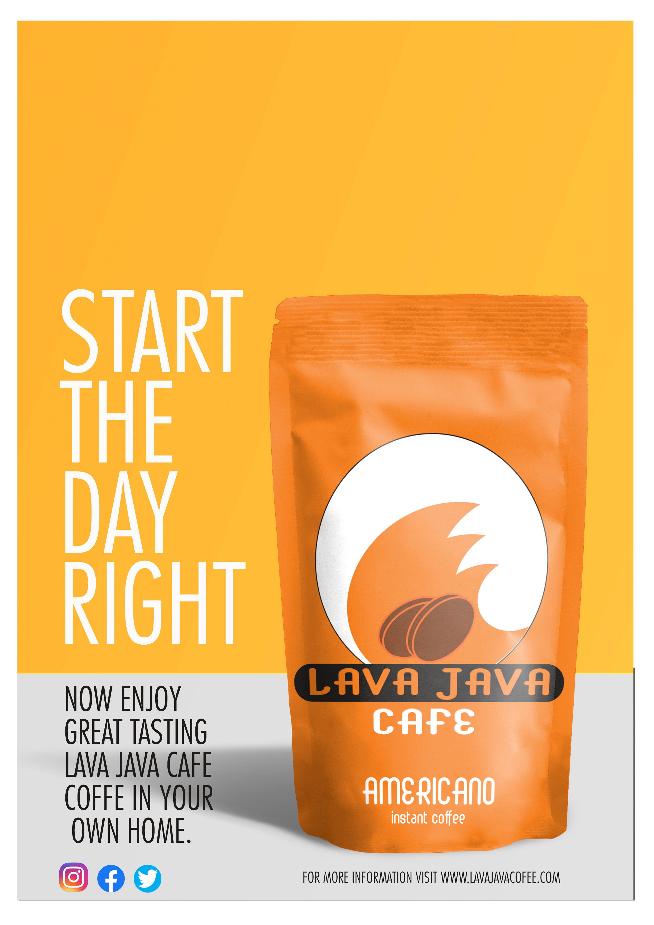
Lava Java Coffee

4
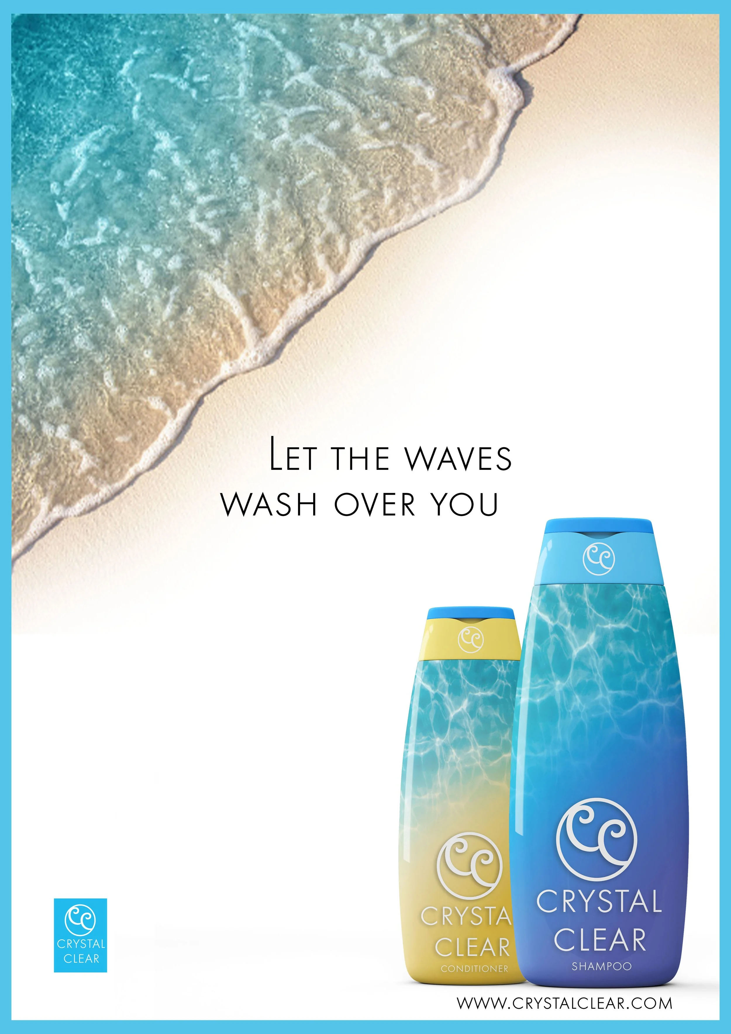
Bottle Product Design

12
Five Day Challenge
3
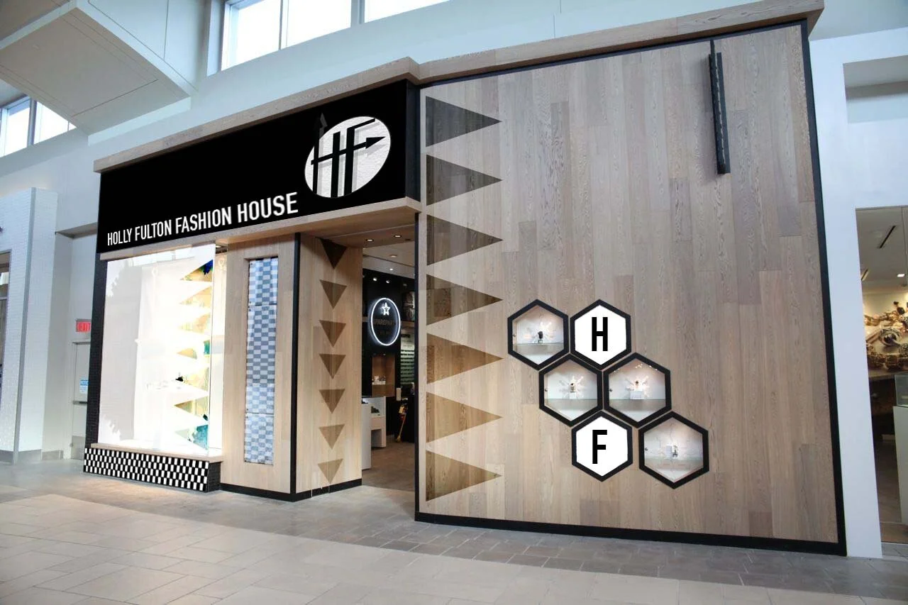
Holly Fulton Rebrand

9
To Kill A Mocking Bird

4
Paranoia

3
Sqwishee

6
BRC Direct Mail
4
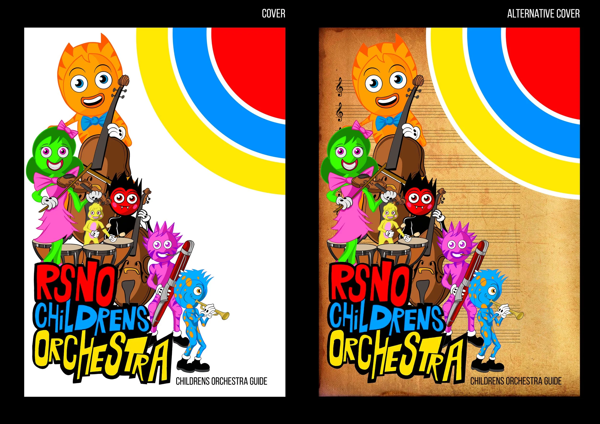
RSNO Childrens Orchestra Guide

5
Graphic Design festival Scotland 2018

7
Zenergy Energy Drink

11
COMICbooks HND Graded Unit

7
POSTERS & LEAFLETS

3
Raylin Stress Analysis
3
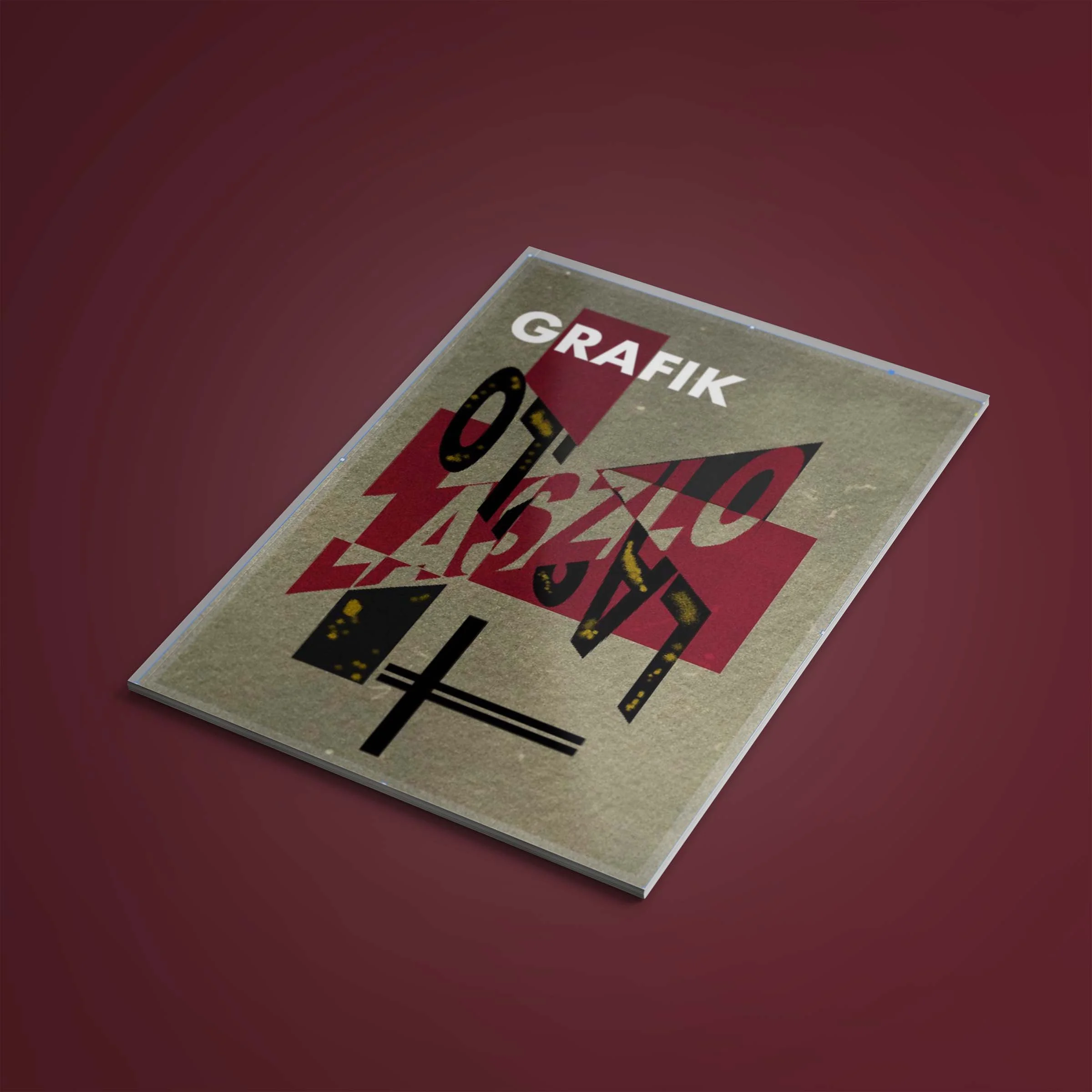
Grafik

5
Ardroy

2
Masquerade of Murder Book Cover
2
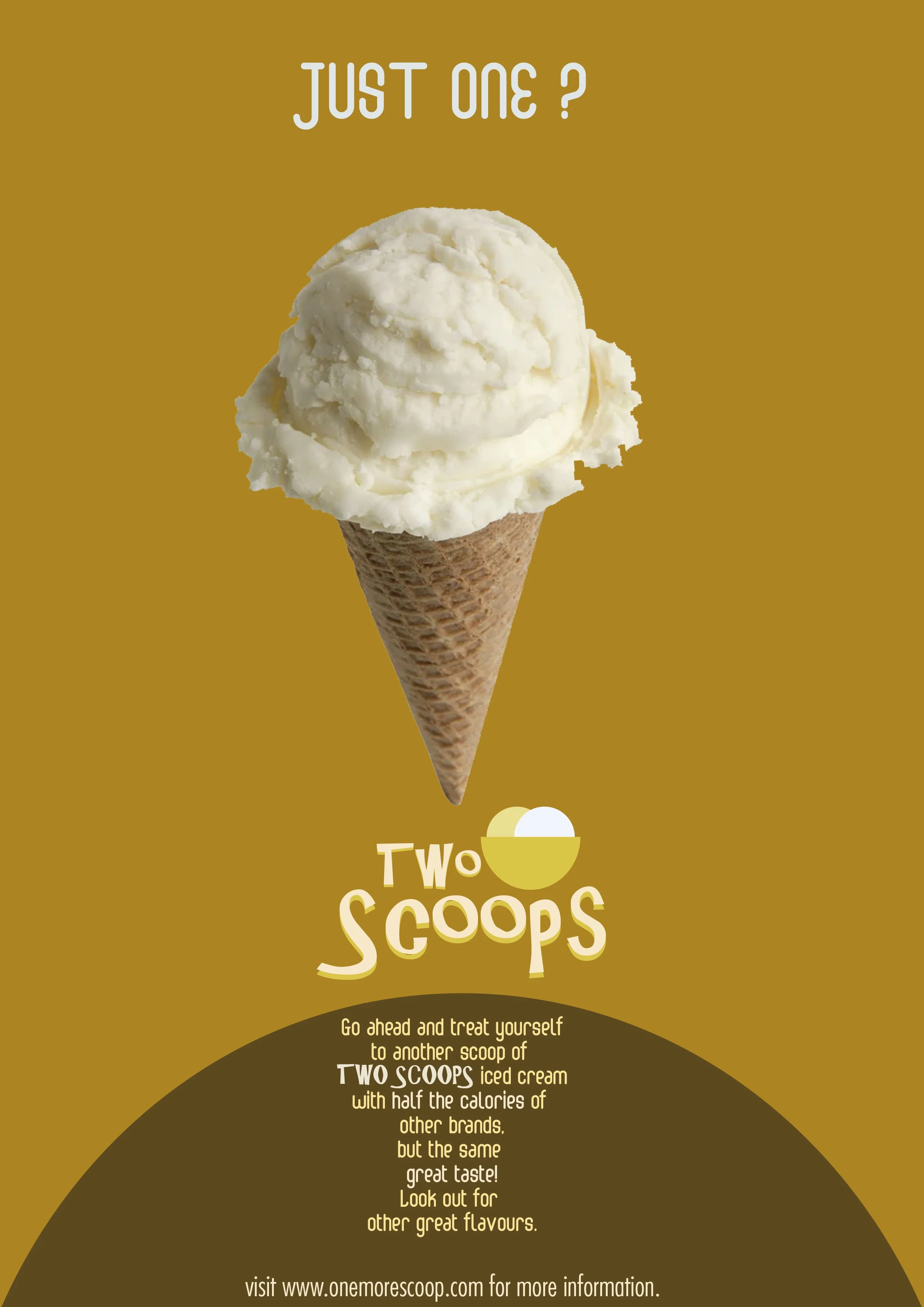
Sawdust Advertisement

5
ZOO YORK BAGS & TAGS

3
Skateboard Designs

6
Something Something Music

4
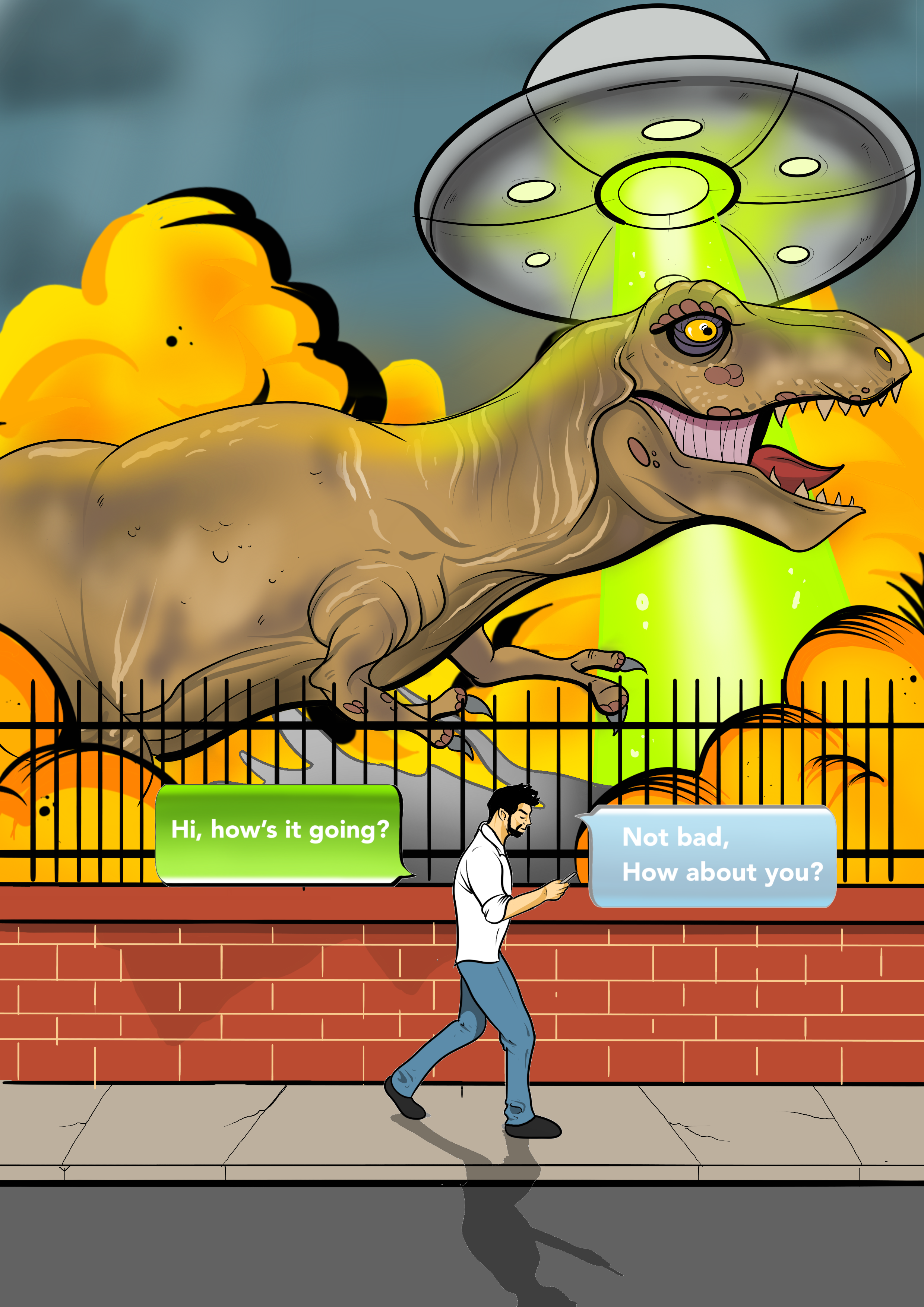
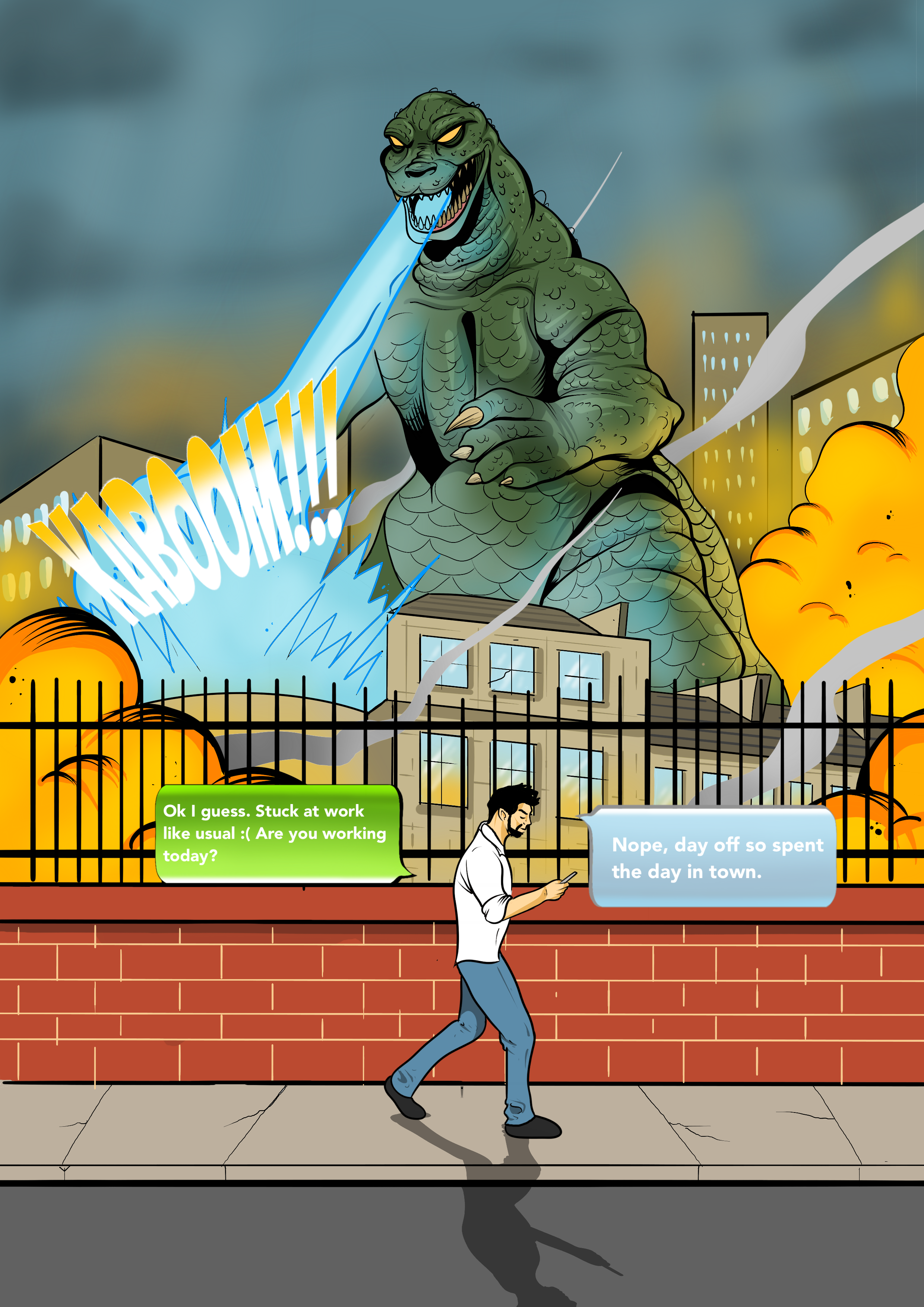
Mobile Phone Campaign

5
MOBILE PHONE CAMPAIGN 2

3
tribal instinct

3
Comic Book Art